A bold supplements brand built to energize and perform
create something clean, and confident.
We started where it matters most… the brand name.
After studying a saturated wellness market, we weren’t looking for something clever, we were looking for something people would trust without hesitation and that can create instant brand recall.
recomnd feels familiar, like it’s always been there. That was deliberate. recomnd immediately signals authority without leaning on clinical language or having to overexplaining itself.
From recomnd, the identity followed the same principle. Create something clean, and confident.
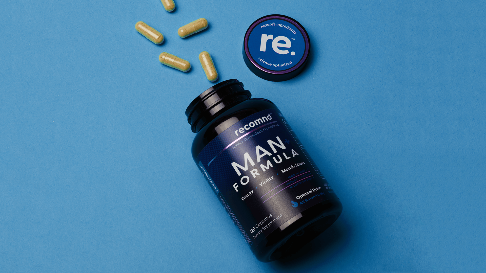
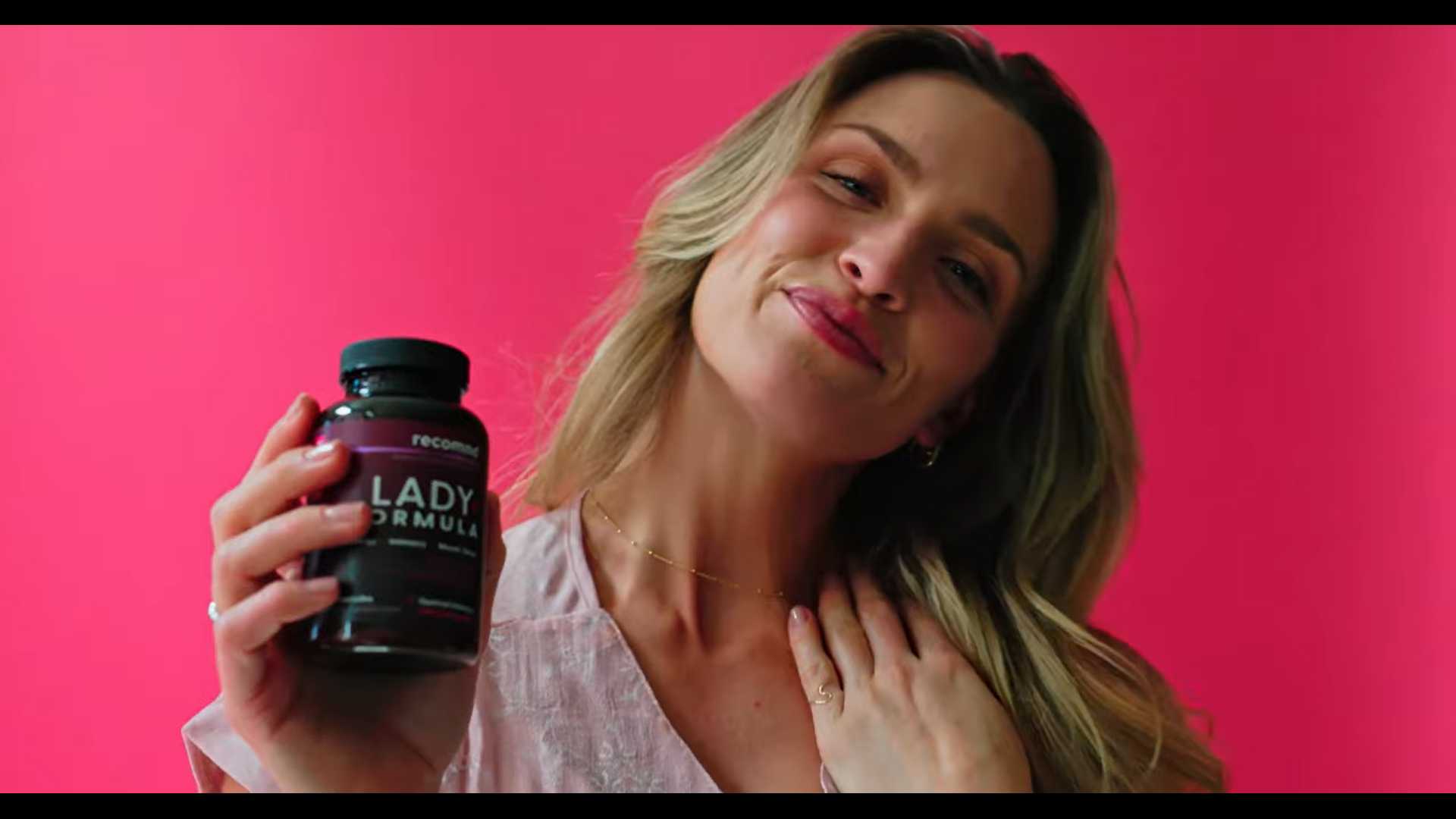
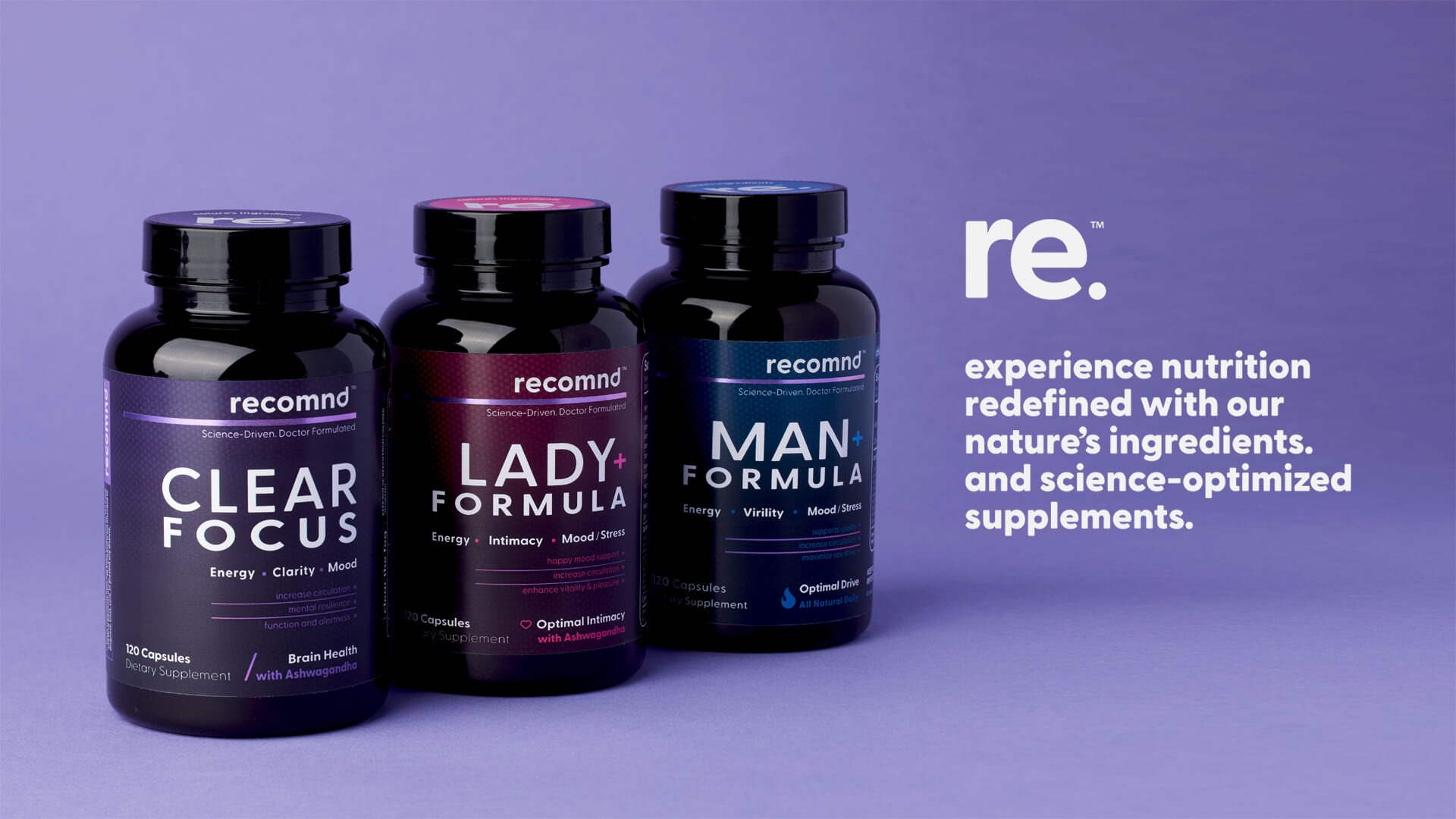
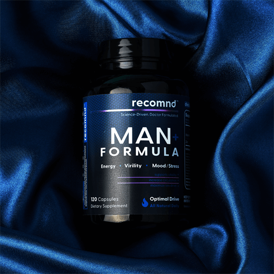
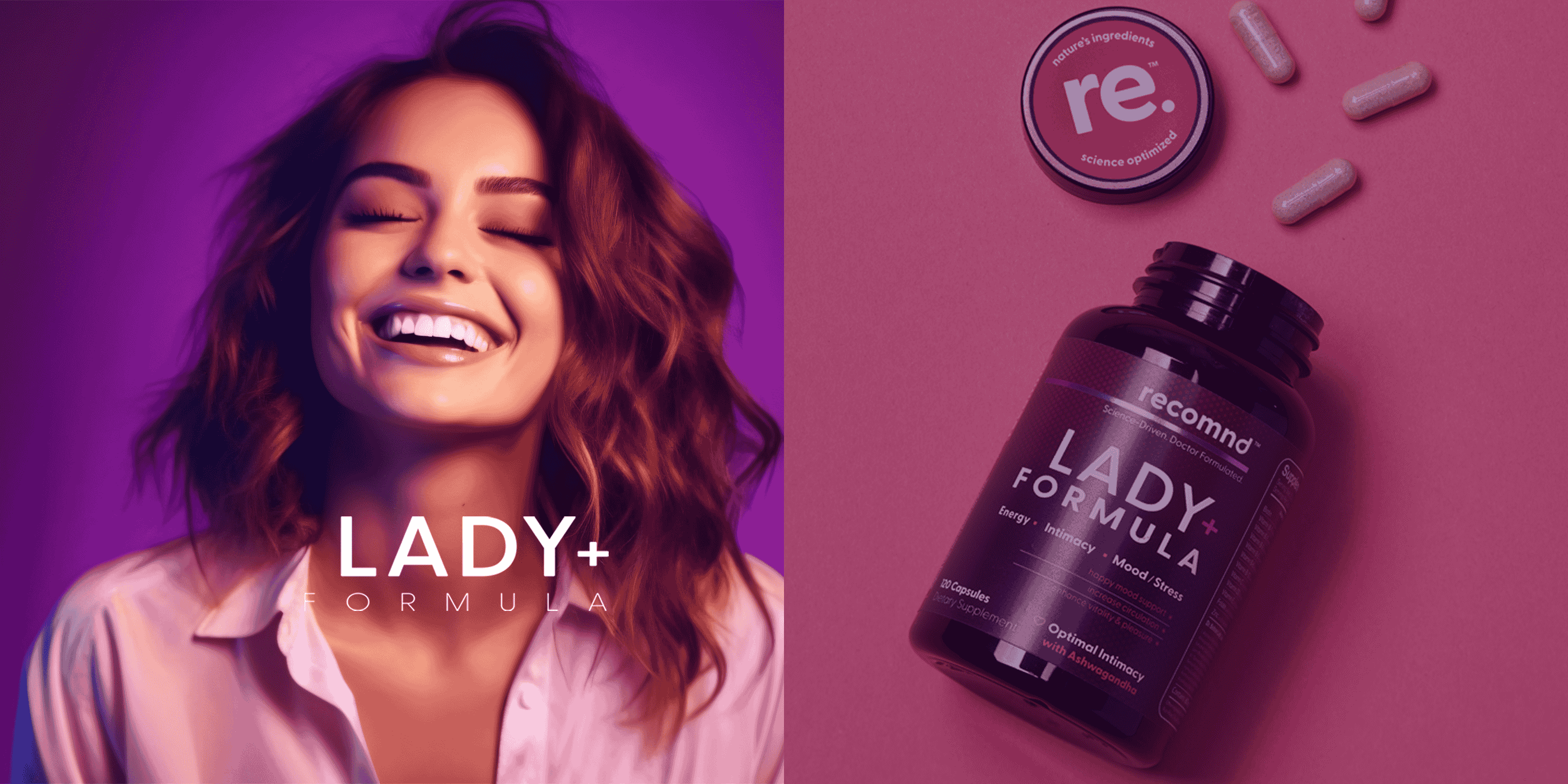
Packaging was designed for how people actually shop today: Amazon first, shelf second. Strong hierarchy. Immediate readability. Benefits that land in seconds.
The product system came next:
CLEAR FOCUS.
MAN+.
LADY+.
Then we extended that thinking into digital. Shopify, social, content.
Remove friction. Guide behavior. Let the product do the talking.
Because in this insanely crowded space, consumers want to feel certain,
and see transparency.
That’s really what we built here, a brand system that earns trust quickly,
a brand people will… recomnd.

What changed...
From naming to identity, packaging to digital, content to launch… lightbulb handled end to end.